使用说明
突然想要在自己网站底部增加一个在线联系的悬浮按钮,就找到了下方代码。如果想要在自己的WordPress中也集成这样一个悬浮按钮,可以将下方三段代码加入主题【footer.php】文件中的【</body>】标签内即可。
CSS源码
<style>
    @keyframes scaleToggleOne { 0 {
        transform:scale(1);
        -webkit-transform:scale(1)
    }
    50% {
        transform:scale(2);
        -webkit-transform:scale(2)
    }
    100% {
        transform:scale(1);
        -webkit-transform:scale(1)
    }
    }
    @keyframes scaleToggleTwo { 0 {
        transform:scale(1);
        -webkit-transform:scale(1)
    }
    20% {
        transform:scale(1);
        -webkit-transform:scale(1)
    }
    60% {
        transform:scale(2);
        -webkit-transform:scale(2)
    }
    100% {
        transform:scale(1);
        -webkit-transform:scale(1)
    }
    }
    @keyframes scaleToggleThree { 0 {
        transform:scale(1);
        -webkit-transform:scale(1)
    }
    33% {
        transform:scale(1);
        -webkit-transform:scale(1)
    }
    66% {
        transform:scale(2);
        -webkit-transform:scale(2)
    }
    100% {
        transform:scale(1);
        -webkit-transform:scale(1)
    }
    }
    .animated { -webkit-animation-duration: .5s; animation-duration: .5s; -webkit-animation-fill-mode: both; animation-fill-mode: both }
    .livechat-girl { width: 60px; height: 60px; border-radius: 50%; position: fixed; bottom: 0; right: 40px; opacity: 0; -webkit-box-shadow: 0 5px 10px 0 rgba(35,50,56,.3); box-shadow: 0 5px 10px 0 rgba(35,50,56,.3); z-index: 700; transform: translateY(0); -webkit-transform: translateY(0); -ms-transform: translateY(0); cursor: pointer; -webkit-transition: all 1s cubic-bezier(.86, 0, .07, 1); transition: all 1s cubic-bezier(.86, 0, .07, 1) }
    .livechat-girl:focus { outline: 0 }
    .livechat-girl.animated { opacity: 1; transform: translateY(-40px); -webkit-transform: translateY(-40px); -ms-transform: translateY(-40px) }
    .livechat-girl:after { content: ''; width: 12px; height: 12px; border-radius: 50%; background-image: linear-gradient(to bottom, #26c7fc, #26c7fc); position: absolute; right: 1px; top: 1px; z-index: 50 }
    .livechat-girl .girl { position: absolute; top: 0; left: 0; width: 100%; height: auto; z-index: 50 }
    .livechat-girl .animated-circles .circle { background: rgba(38,199,252,.25); width: 60px; height: 60px; border-radius: 50%; position: absolute; z-index: 49; transform: scale(1); -webkit-transform: scale(1) }
    .livechat-girl .animated-circles.animated .c-1 { animation: 2s scaleToggleOne cubic-bezier(.25, .46, .45, .94) forwards }
    .livechat-girl .animated-circles.animated .c-2 { animation: 2.5s scaleToggleTwo cubic-bezier(.25, .46, .45, .94) forwards }
    .livechat-girl .animated-circles.animated .c-3 { animation: 3s scaleToggleThree cubic-bezier(.25, .46, .45, .94) forwards }
    .livechat-girl.animation-stopped .circle { opacity: 0!important }
    .livechat-girl.animation-stopped .circle { opacity: 0!important }
    .livechat-girl .livechat-hint { position: absolute; right: 40px; top: 50%; margin-top: -20px; opacity: 0; z-index: 0; -webkit-transition: all .3s cubic-bezier(.86, 0, .07, 1); transition: all .3s cubic-bezier(.86, 0, .07, 1) }
    .livechat-girl .livechat-hint.show_hint { -webkit-transform: translateX(-40px); transform: translateX(-40px); opacity: 1 }
    .livechat-girl .livechat-hint.hide_hint { opacity: 0; -webkit-transform: translateX(0); transform: translateX(0) }
    .livechat-girl .livechat-hint.rd-notice-tooltip { max-width: 1296px!important }
    .livechat-girl .livechat-hint.rd-notice-tooltip .rd-notice-content { width: auto; overflow: hidden; text-overflow: ellipsis }
    @media only screen and (max-width:1599px) {
        .livechat-girl .livechat-hint.rd-notice-tooltip { max-width: 1060px!important }
    }
    @media only screen and (max-width:1309px) {
        .livechat-girl .livechat-hint.rd-notice-tooltip { max-width: 984px!important }
    }
    @media only screen and (max-width:1124px) {
        .livechat-girl .livechat-hint.rd-notice-tooltip { max-width: 600px!important }
    }
    .rd-notice-tooltip { -webkit-box-shadow: 0 2px 2px rgba(0,0,0,.2); box-shadow: 0 2px 2px rgba(0,0,0,.2); font-size: 14px; border-radius: 3px; line-height: 1.25; position: absolute; z-index: 65; max-width: 350px; opacity: 1 }
    .rd-notice-tooltip:after { position: absolute; display: block; content: ''; height: 20px; width: 20px; -webkit-box-shadow: none; box-shadow: none; -webkit-transform: rotate(-45deg); -moz-transform: rotate(-45deg); -ms-transform: rotate(-45deg); -o-transform: rotate(-45deg); transform: rotate(-45deg); -webkit-border-radius: 3px; -moz-border-radius: 3px; border-radius: 3px; z-index: 50 }
    .rd-notice-tooltip .rd-notice-content { background: 0; border-radius: 3px; width: 100%; color: #fff; position: relative; z-index: 60; padding: 20px; font-weight: 400; line-height: 1.45 }
    .rd-notice-type-success { background-color: #26c7fc; -webkit-box-shadow: 0 5px 10px 0 rgba(38,199,252,.2); box-shadow: 0 5px 10px 0 rgba(38,199,252,.2) }
    .rd-notice-type-success .rd-notice-content { background-color: #26c7fc }
    .rd-notice-type-success:after { background-color: #26c7fc; -webkit-box-shadow: 0 5px 10px 0 rgba(38,199,252,.2); box-shadow: 0 5px 10px 0 rgba(38,199,252,.2) }
    .rd-notice-position-left { margin-left: -20px }
    .rd-notice-position-left:after { right: -6px; top: 50%; margin-top: -10px }
    .rd-notice-tooltip.single-line .rd-notice-content { height: 40px; padding: 0 20px; line-height: 40px; white-space: nowrap }
</style>
HTML源码
<div class="livechat-girl animated"> <img class="girl" src="https://www.qcwlseo.com/logo/en_3.png">
<div class="livechat-hint rd-notice-tooltip rd-notice-type-success rd-notice-position-left single-line show_hint">
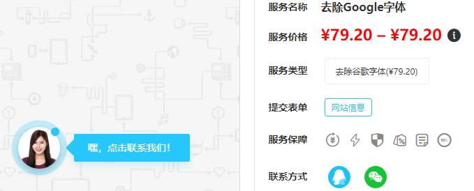
<div class="rd-notice-content">嘿,点击联系我们!</div>
</div>
<div class="animated-circles">
<div class="circle c-1"></div>
<div class="circle c-2"></div>
<div class="circle c-3"></div>
</div>
</div>
JS源码
<script type="text/javascript">
    (function($) {
        setInterval(function(){
            if($(".animated-circles").hasClass("animated")){
                $(".animated-circles").removeClass("animated");
            }else{
                $(".animated-circles").addClass('animated');
            }
        },3000);
        var wait = setInterval(function(){
            $(".livechat-hint").removeClass("show_hint").addClass("hide_hint");
            clearInterval(wait);
        },4500);
        $(".livechat-girl").hover(function(){
            clearInterval(wait);
            $(".livechat-hint").removeClass("hide_hint").addClass("show_hint");
        },function(){
            $(".livechat-hint").removeClass("show_hint").addClass("hide_hint");
        }).click(function(){
            window.location.href = 'http://wpa.qq.com/msgrd?v=1&uin=1075750606&site=qq&menu=yes';

        });
    })(jQuery);
</script>


评论
0 访客 0